How to Use Responsive Images in HTML5 with Srcset and Sizes
Serving a desktop-sized 2000px wide image to a smartphone screen is one of the most common causes of slow mobile performance. Responsive web design requires responsive image assets. This article guides you step-by-step through HTML5 native image scaling techniques like srcset, sizes, and the picture element to automatically serve optimized sizes.
1. The Problem with Fixed Image Widths
Historically, web developers loaded images with a single <img src="image.jpg"> tag. While CSS can resize this image to fit a mobile screen, the browser still downloads the entire heavy file. Responsive images fix this by giving the browser a set of options, allowing it to choose the best file based on screen resolution and bandwidth.
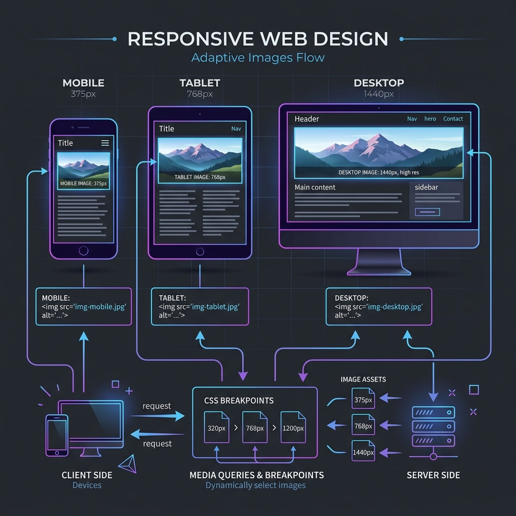
2. Demystifying the Srcset Attribute
The srcset attribute defines a list of image sources with their respective physical widths in pixels (using the w descriptor). The browser reads this list, checks the current viewport, and requests only the correct image size.
<img src="photo-fallback.jpg"
     srcset="photo-small.jpg 400w, photo-medium.jpg 800w, photo-large.jpg 1200w"
     alt="Responsive layout photography">
3. Implementing Responsive HTML5 Image Tags
The srcset attribute tells browsers to select the best image version based on device display resolution, saving mobile bandwidth. Use the HTML5 picture element to define fallback WebP and JPEG assets for flexible layout support.
Using the picture element, you can define different sources based on media query dimensions. This allows you to serve WebP files to modern browsers and JPEGs to legacy systems, ensuring high performance across devices. For responsive layouts, setting the sizes attribute defines the width the image will occupy on different screens. This prevents browsers from requesting larger resolutions than needed, minimizing data usage and keeping load speeds high.
In addition, this native layout handling reduces browser execution times. The browser engine parses HTML structures and selects matching image sources before initiating layout rendering, keeping layout compilation smooth and accelerating paint benchmarks.
4. Automating Responsive Resizing and Formatting
Use local batch resizers to generate multiple resolution cuts (such as 480px, 800px, and 1200px) from source files. Save assets as WebP to optimize page speed, then link them in your HTML templates.
Generating these resolution variants can be automated using build scripts or offline compressors. Having pre-resized files ensures that browsers do not resize heavy files on the fly, saving CPU cycles on mobile devices and keeping page layout performance smooth. Pre-generating multiple format cuts is also highly recommended. In addition to WebP, generating AVIF formats provides even higher size savings, giving developers more tools to build responsive layouts.
Using automated batch scripts to output these cuts saves developer time during design cycles. Pre-generating images in bulk ensures that every responsive breakpoint is supported, providing high consistency across layout layouts.
5. Impact on Core Web Vitals and LCP Benchmarks
Integrating responsive images directly improves Core Web Vitals, particularly Largest Contentful Paint (LCP). Serving appropriately sized images reduces mobile load times, boosting user experience and search rankings.
Responsive layouts prevent mobile browsers from loading large desktop assets, reducing data usage and accelerating render times. This optimization improves site accessibility and user experience, helping your pages rank higher in organic search result grids, boosting mobile responsiveness.
6. The Security Architecture of Local Client-Side Processing
Unlike traditional online image utilities that require uploading private assets to cloud servers, TinyImagefy performs all file calculations directly inside the user's browser runtime memory. By utilizing modern web APIs such as the HTML5 Canvas API, the File Reader API, and WebAssembly (WASM) modules, the website parses binary image streams locally. This serverless execution model eliminates transmission overhead, making it impossible for malicious entities or database leaks to compromise your personal documents, photography portfolio, or sensitive ID scans. All operations execute strictly within the local browser sandbox, providing enterprise-grade security for everyday workflows.
7. Compliance and Regulatory Benefits of Serverless Tools
Processing media assets locally aligns perfectly with strict international data protection regulations, including the General Data Protection Regulation (GDPR) in Europe and the California Consumer Privacy Act (CCPA) in the United States. Since no image files, EXIF headers, or metadata profiles are uploaded, stored, or processed on remote server arrays, TinyImagefy acts as a passive container. This means businesses, developers, and photographers can sanitize their visual assets, strip GPS coordinates, or crop passport photos without worrying about data processing agreements or regulatory compliance issues. Keeping your files offline is the ultimate way to maintain data sovereignty in a hyper-connected digital landscape.
Frequently Asked Questions
Yes — 100% free, unlimited, no signup. All tools work forever at no cost.
Never. Everything runs in your browser. Your files never leave your device.
JPG, PNG, WebP, AVIF, HEIC, BMP, GIF, SVG, TIFF, and PDF — across 30+ tools.
Yes — works perfectly on iPhone, Android, tablet, and desktop browsers.
The TinyImagefy team builds privacy-first browser tools for image processing. All tools run 100% locally — no uploads, no servers, no tracking. We've helped millions of users compress, convert, and edit images safely since 2024.
About Us →